CardSeer

The Challenge
Refreshing a brand before a national debut
Card Seer, a startup building a marketplace aggregator for trading cards, was preparing to debut their app at a national convention. The founder needed a cohesive, professional visual presence—from app UI to marketing collateral—that would build credibility, communicate value clearly, and stand out in a competitive tech-and-hobbyist space.
The Solution
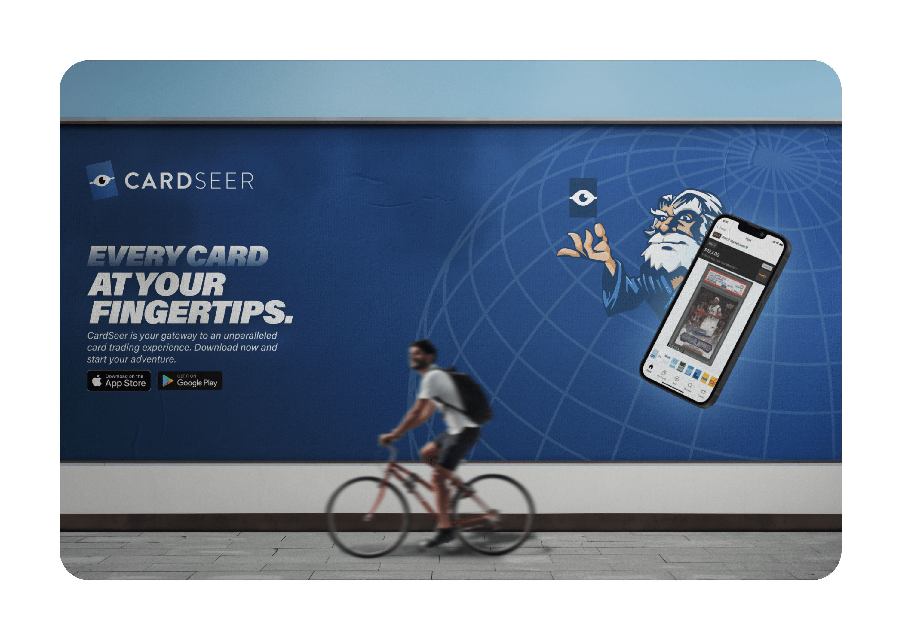
A unified design system across app, brand, and physical experience
We refreshed the user interface for the Card Seer app to emphasize clarity, usability, and trust. I also led the visual direction for the event presence: designing standing posters, marketing strategy, and spatial layout for their conference booth. Finally, we aligned their public website with the refreshed brand—giving the startup a sharp, confident look to match their launch moment.
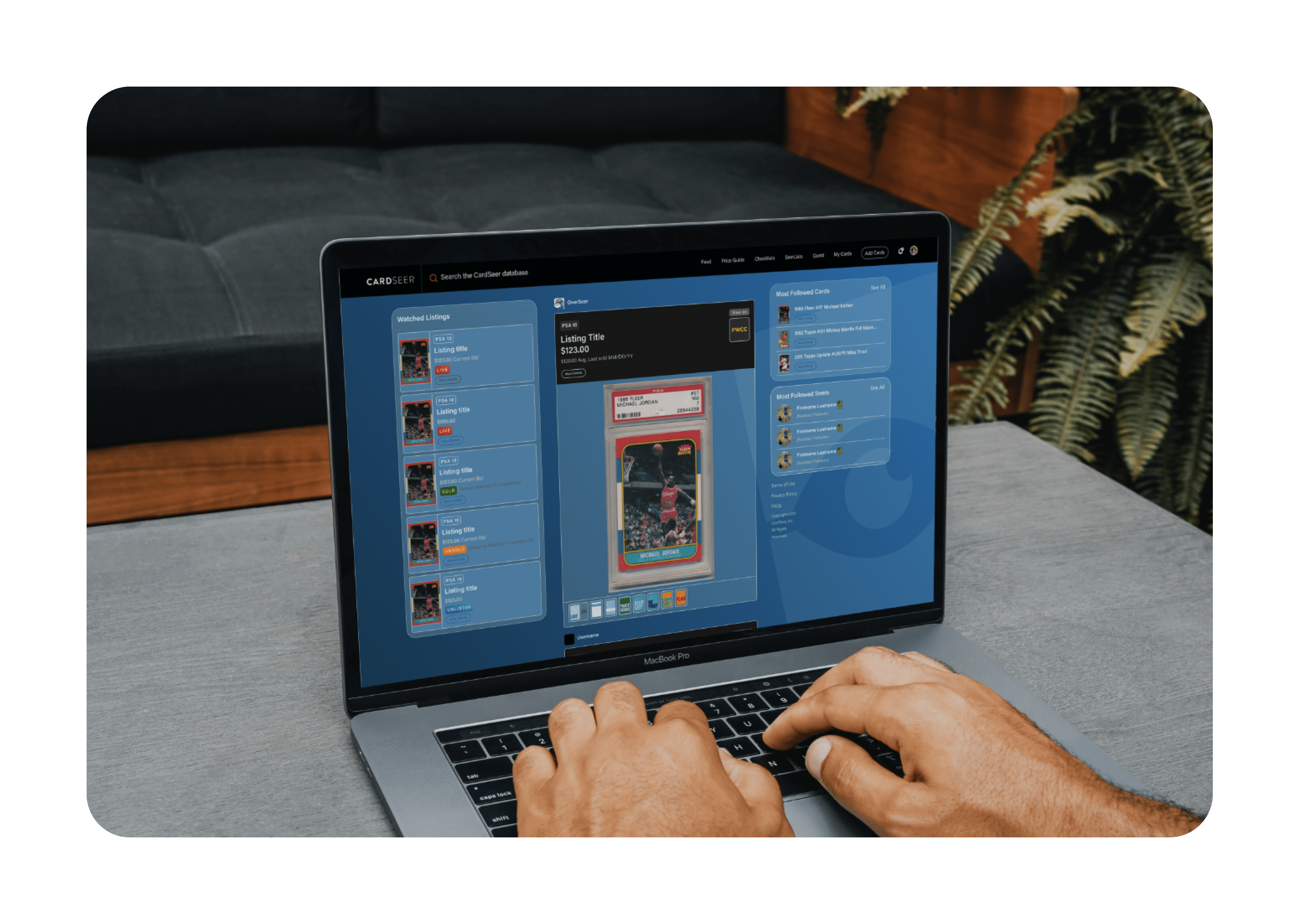
Elevating the App Experience
We began by overhauling the app UI. The original interface felt generic and didn’t reflect the depth or sophistication of the product. I redesigned core components to feel sleeker and more trustworthy, building a system that could scale as the product evolved.
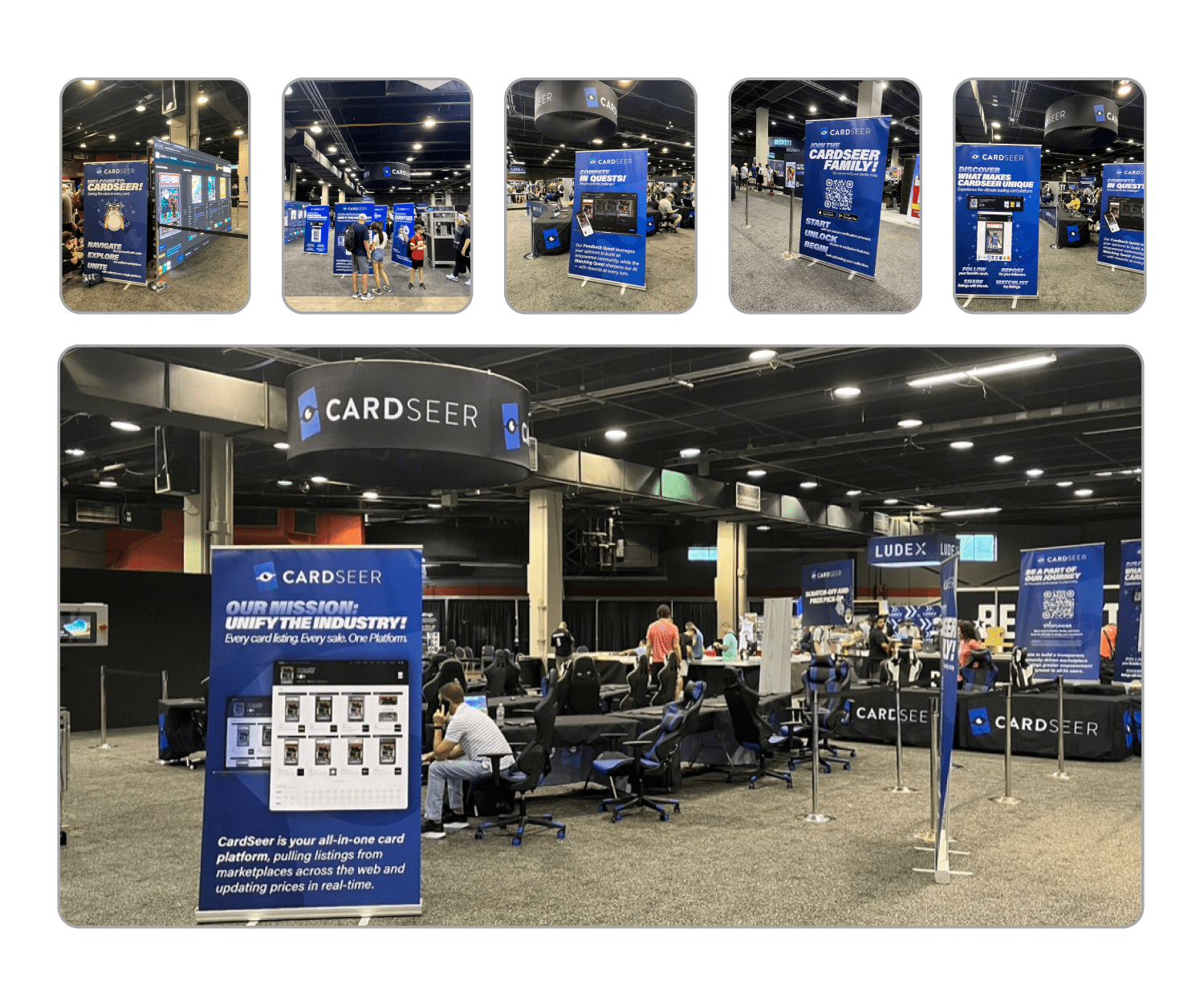
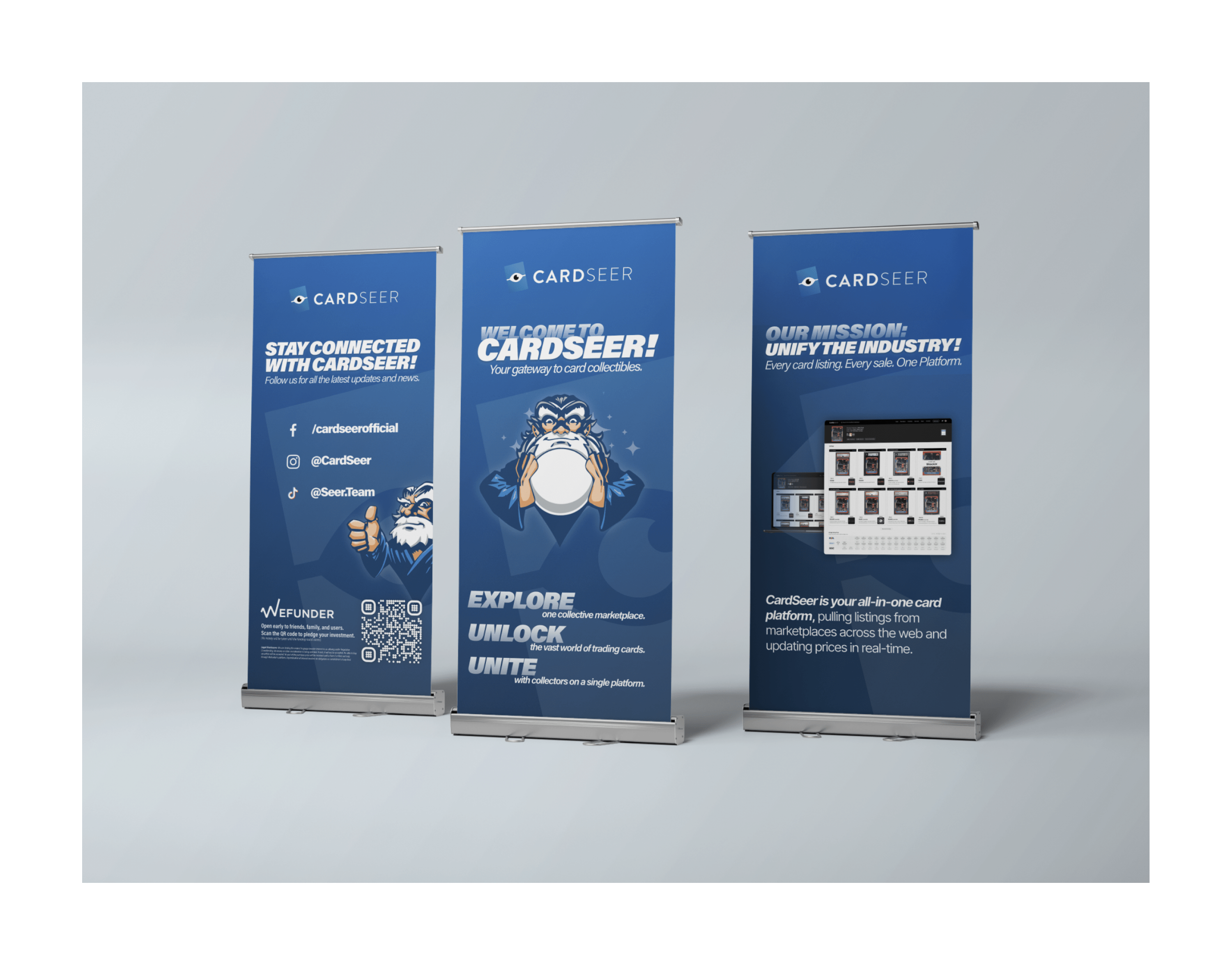
Designing the Convention Experience
With the app UI in motion, I turned to the event strategy. I helped shape the entire booth experience, from how users would physically move through the space to what story each poster would tell. We settled on 8 standing posters to walk attendees through the product journey and market problem it solves.
Bringing It All Together
To complete the brand picture, I rebuilt Card Seer’s public website with a clean, modular layout focused on investor appeal and ease of updates. The site acts as a hub for both potential users and business development contacts.